Why You Shouldn't Break the Bank on a Small Business Logo

When your running a small business, every dollar counts; don't waste your money in the early stages of growing your business. Pigeonholding your funds into one area of marketing isn't going to bring you wild success. Take the time to make a marketing plan, and work towards a healthy and strong brand.
Simple is better.
You shouldn’t have to break the bank on your small business logo. Logos should be simple, not extravagant and complex! In fact, a simple and clear logo is more effective and memorable than a busy and cluttered one. This is because a logo’s job is to make a quick connection to your brand. Prospects shouldn’t have to sit and study your logo in order to make that connection, or decipher meaning from it.
Think about the simple logos you’ve come across that make an impact without saying a word (e.g., Nike, Apple, McDonald’s). Now take a look at the below busy logos. It’s pretty clear that a complex logo doesn’t equal a powerful one.


Entrepreneurs are often excited to get their businesses off of the ground. They assume that an intricate and fancy logo will do that for them. Spend your money and resources on solidifying your ideas and infrastructure first.
Here’s a tip: Use a designer on Fiverr to help you create your logo. It will be simple, attractive and won’t break the bank.
Rebranding is bound to happen.
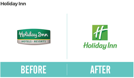
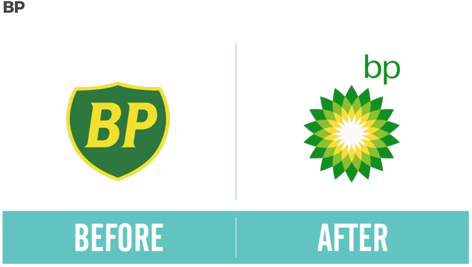
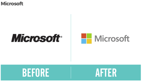
Ideally, you’d want your logo to stand the test of time—to never go out of style, and keep its flare. That can be hard, which is why many brands undergo a rebrand at some point throughout the life of the company. Even some of the biggest brands undergo a rebrand to keep their image fresh and relevant. Here are a few brands you may recognize that went through some rebranding over the years:


The bottom line is that your logo very well may change in a couple years. Take your time and design it well, but don’t feel the need to drop your life savings into it.
As an example, Accelity’s first logo came from Fiverr (see our tip in the section above). When the time came for a rebrand (about 3 years later), we asked our internal graphic designer to update our logo. Not only do we receive a lot of compliments on the new logo, we also didn’t waste money in the process of creating either.
![]()
![]()
Be smart when it comes to allocating resources for your small business marketing. Focus on your company as a whole, and make sure it has a strong base to grow from. Put some time into your logo and make it work for you, but don’t let your logo drain your funds in the process.
Do you have other thoughts on how to create an economical logo? Let me know in the comments below!


