The 5 Best Companies Using Smart Color Design to Promote Their Brand
The goal for any company is to become recognizable and successful. When it comes to design, a good way to get there is by using smart color design in order to promote your brand.
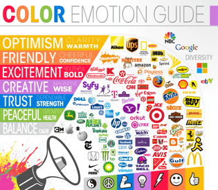
Take a look at the guide below. The color you choose to use in your logo will produce certain emotions in the customer. Its an easy way to promote your message without even saying a word!
There are a few companies that do a great job of setting themselves apart from the rest when it comes to promoting their brand and using smart color design.
1. Lush
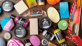
One of my favorite brands out there is Lush. Unique is an understatement when describing this company. They do an excellent job of promoting themselves with their unique design, making it simple to distinguish Lush Cosmetics from its competitors.
There are hundreds of different colors within the Lush product line, but when it comes to their packaging, they consistently tie everything together with sleek white on black labels. This is a great way to balance all of their colors and keep a strong brand identity.
2. Naked Pizza
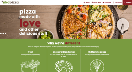
Naked Pizza picked a smart brand color for a couple reasons. This shade of green is unique enough so that you don’t immediately think of a different brand, especially in the pizza business. When I think of pizza, my mind goes to red for Pizza Hut, or a blue and red combo for Domino’s right away.
By using this color, Naked Pizza can also play to the aspect of health. Most of us associate green with a healthy, clean lifestyle. Which is exactly what Naked Pizza is playing up in their approach. They are selling simple, low-calorie, build it yourself pizzas.
3. Charity: Water
Charity Water does a great job of evoking emotion with their design. The black and white in the design make the
message clear, whereas the yellow in the water jug brings out the emotion of hope or optimism. Yellow is a great color to use when you want to draw attention, and in the case of this charity, I think that’s a great strategy.

4. Hershey’s
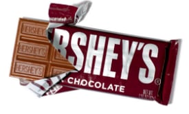
Hershey’s did a simple trick with their color design—they associated the brand’s color with the color of the product. Brown packaging, brown chocolate. They throw in silver as the accent color, a unique choice, to complete their timeless brand.
5. Home Depot
The Home Depot is another brand with a simple yet strong design. The choice of an orange logo is good for this home improvement company, because it can be quickly associated with construction. Orange does a good job of coming across as a friendly color to customers as well.
The best smart color design for your brand is going to depend entirely on your company’s mission and the product or services you provide. Try to pick a color that speaks the loudest to your audience and evokes quick emotion. Choose a color or set of colors that may quickly spike an association for the viewer. Simplicity is a common thread through a majority of these iconic brands.
Now it’s time to take what you learned above and try to apply it to your own brand—and if you have any other examples of top brands that use color well, share in the comments below!


