When it comes to email marketing, there is almost always something you can improve on. When you have an audience that is interested in your product or service right at your fingertips, use that to your advantage and deliver your message in the most effective way possible. Here are a few tips to improve your email marketing design in order to captivate your audience and increase conversion.
Really think about your layout.
Before you start to draft out your email, think about the layout and what is going to be the most pleasurable for the reader. Keep in mind that you should balance your composition by thinking about symmetry and the proper ratio of pictures and text. Try to use minimal distractions as well. When placing relevant images with your text, try placing them side by side rather than one on top of the other, for ease of understanding.
Use color to draw some attention.
It’s no secret that bright colors draw attention, so use them! Apply vibrant accents to highlight your main message or use them in your CTA to move people to act. The use of bright colors brings contrast to your email, as well as ties the piece together if you use it thoughtfully throughout your email.

Use shapes in your design.
By using shapes in your email design, you draw the reader’s focus without taking too much away from the message you want to deliver. Shapes can easily make your email aesthetically pleasing. The use of square shapes can bring structure and rounded shapes can be very inviting for the viewer. This tactic is a good way to upgrade your email if it is very text heavy.
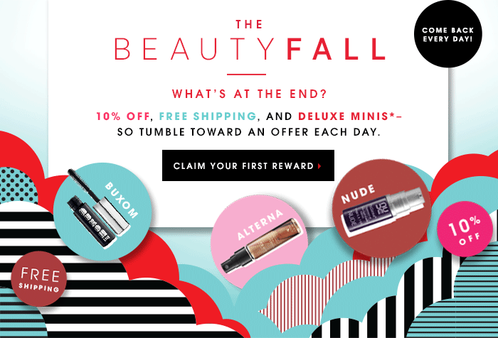
Portray your message graphically.
In order to portray the message of your email graphically, pull out the main themes of your email and grab pictures or icons to represent them. This way, as soon as someone opens your email, they will see your graphics and have an instant understanding as to what your email might be about.
Use whitespace.
Simplicity is one of the best traits you can use when designing your email. It makes your email easy to read, and people can navigate through it quickly. Nobody wants to read the same email for 10 minutes! Taking advantage of whitespace makes it easy to identify the central focus of your email, as well as the hierarchy that the email follows.
Be seamless.
The more seamless your email is, the better. If your email is broken up into several sections or boxes, it is just an invitation for the reader to stop reading. Try to use a background image that continues the entire length of the email. It will keep the reader scrolling. Using less borders and harsh lines can help improve the flow of your email.
Make an impact.
Lastly, make sure your email sticks with the reader. Create a unique email by using different fonts and colors. You can mix up the use of thick and thin fonts or serif and san serif fonts. Try to improve your brand awareness through your emails; people will start to recognize your content faster.
Have you used a few of these elements? How did your readers respond? How has it affected your conversions? Let me know in the comments below.
Are you looking to boost your email conversions? Contact Milwaukee marketing agency, Accelity Marketing.